

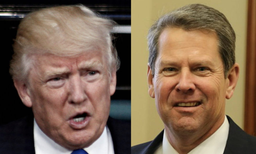
Donald Trump’s Georgia stooge Brian Kemp has a whole new problem
The United States is under attack by two diseases that defy reason, threaten lives, and confound us even as their familiarity grows. One of them is COVID-19 and the other is Trumpism. Science must remedy the first disease as soon as possible. Conquering the second disease, however, remains an elusive mess of a task that absolutely must happen on Election Day.
Trumpism cares nothing of truth or facts because the only thing that matters to those afflicted with this disease is appearances. An incident in Georgia this week makes it abundantly clear that Trumpism is not a personality quirk specific to the man-child and his minions but a pathological contagion that infects people in power across the country.
A statistical graph is an important tool because a glance displays the trajectory or shape of a trend while a scrutiny reveals the key data behind it. However, Georgia Governor Brian Kemp’s recent graph, which featured a misleading presentation of data, is an appalling exception. The x-axis, which included the dates of infection rates in five counties over a 15-day period, did not follow a chronological or coherent sequence. In addition, the groups of five counties charted appeared each time in a different order. (See the misleading graph here, courtesy of political reporter Stephen Fowler.)
The notion that there was a negligent portrayal of data in the graphs, which itself would be inexcusable, cannot be argued with a straight face. What may appear to be randomness was clearly by design, as the data fell in line to paint a deceptive false picture of how COVID-19 has supposed diminished significantly in every county. This graph was fashioned with an intent to mislead, and so it is not the product of gross incompetence but one of shameless propaganda.
Fortunately, Georgia pulled the graph, though only in the wake of backlash and a letter from state Rep. Scott Holcomb to Kemp calling it “cuckoo,” accordingt to the Atlanta Journal-Constitution. A Kemp spokesperson apologized, although she refused to acknowledge any deceit, tweeting: “The x axis was set up that way to show descending values to more easily demonstrate peak values and counties on those dates. Our mission failed. We apologize. It is fixed.”
Although Trump did not create this graph, he inspires and blesses such self-serving madness by pulling such stunts himself with impunity. In September’s “Sharpiegate,” to cite just one example, Trump brazenly presented a doctored map of Hurricane Dorian’s path to support his inaccurate tweet a few days earlier that Alabama “will most likely be hit (much) harder than expected.”
COVID-19 and Trumpism are different horrifying diseases, yet when both afflict the nation at once, the results can be extraordinarily toxic. This year must mark the end of both COVID-19 and Trumpism, and we must also aim to make 2021 a long overdue year of hope and healing in what can be the promising start of a glorious new chapter in American history.

Ron Leshnower is a lawyer and the author of several books, including President Trump’s Month